


10 Beautiful Big Data Visualizations
Big Data is big. We know it, you know it, everyone knows it. But what can we do with it? Let’s take a look at 10 amazing Big Data visualizations.
Visualizing Big Data in what are already being called little works of art, is one of the ways in which the giant webs of information can make sense to anyone not familiar with the ins and outs of zeroes and ones.
Let’s take a look at some of these Big Data artworks.
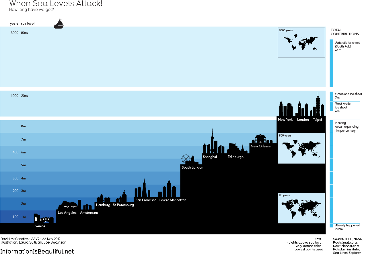
1. When sea levels attack!
This beautiful graph by David McCandless shows which cities would go down in which order, when the sea level rises in the coming years.
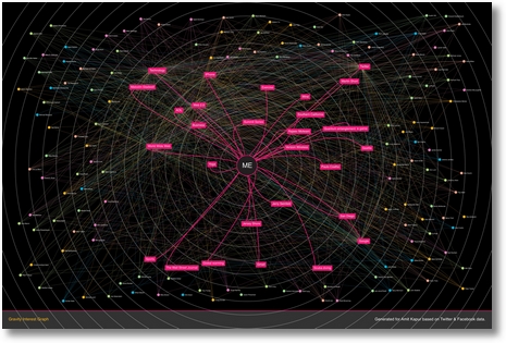
2. Your Social Persona
Gravity, a new startup founded by MySpace, creates an interest graph based on a person’s social media likes, shares and recommendations. It creates a web who you are as a social media user. Take a look at the demo video.
3. Popularity of Facebook usage
In this image, the strenght of the light indicates the popularity of Facebook around the world. This will give the average person a better view of Facebook popularity than tables filled with data.

4. Facebook Connections
WolframAlpha has created a tool that gives you the opportunity to visualize your connections and profile on Facebook. On this website you can connect your profile with the tool, and it will give you multiple graphs about your likes, friends and more.
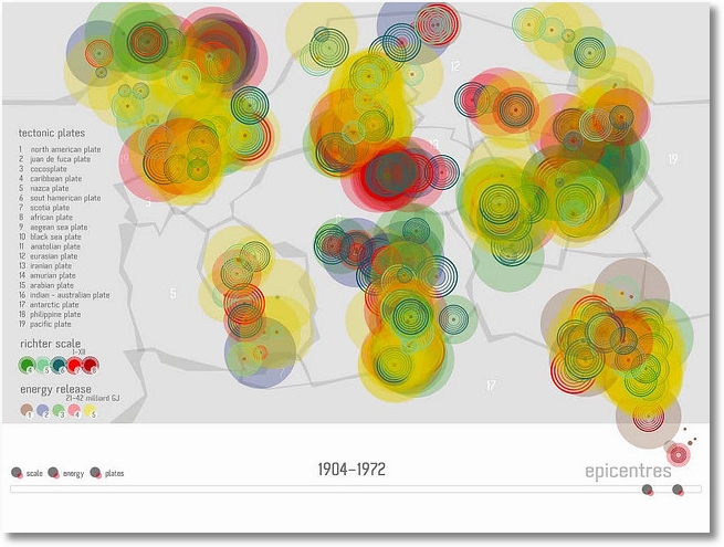
5. Tectonic plates
This graph shows you the activity and movement of the world’s tectonic plates over the past 400 years.
6. Health Infoscape
GE built the Health Infoscape, a map that shows the connection of one disease with another. Based on 7.2 million patient records from GE’s database, it shows how diseases are related and how strongly they correlate.

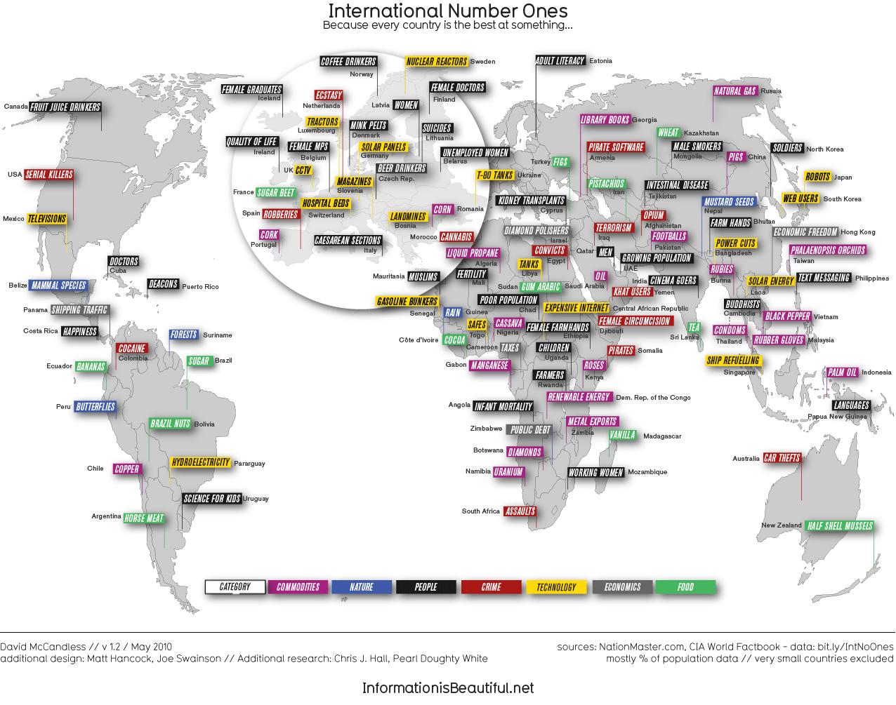
7. Country No. 1
Because every country is good at something! This map shows every countries number 1.
8. Crayola Evolution
This graph shows the evolution of Crayola crayon colours over the past 110 years.

9. LinkedIn Map
On this map you can see your LinkedIn contacts, connected in a beautiful visual. You can create your own with LinkedIn Labs.
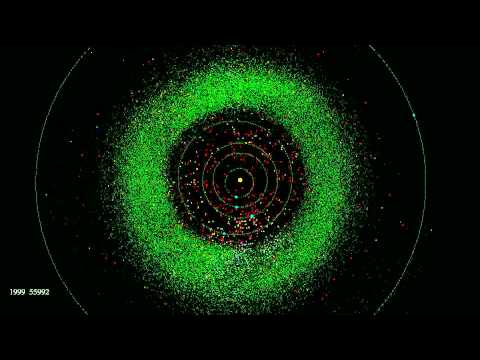
 10. Asteroid discovery
Our one and only video. This video shows the discovery of astroids from 1980 to 2010. Made by Scott Manley of the Armagh Observatory.
Want to see more visualizations? Check out the following pages!
Key Web Metrics
Information is Beautiful
My Opinion
Gotta love beautiful visuals. Especially when they give you valuable information about… well, everything. Big data can be a confusing subject for many, but when it becomes visualized in the ways we’ve seen above, it becomes easy, and fun.
I think these visualizations will become more necessary now that big data is becoming a bigger deal, especially with social media. People love looking at pretty shapes and colours, and that is exactly why visualizations like these are becoming popular.
What About You?
Do you have any amazing visualizations you want to share?
Follow & Share
Want more stories on Big Data? See our category Big Data, join us on Twitter, LinkedIn, Facebook, Pinterest, RSS and get our weekly E-mail Newsletter for updates and free bonus content.
About The Author
Marion aan ‘t Goor is a Social Media Consultant at ICON&Co. You can connect with Marion via Twitter and LinkedIn.


Follow Category?Big Data |
Follow Author?Marion aan 't Goor |
16 more
Follow Tags?adaptive planningasteroidsbig databig data visualizations |
I just like the helpful information you provide in your articles
Everything is very open and very clear explanation of issues. was truly information.
Good info. Lucky me I reach on your website by accident, I bookmarked it. Madridbet , madridbet giriş , madridbet güncel giriş , madridbet yeni giriş , madridbet giriş
Good info. Lucky me I reach on your website by accident, I bookmarked it. Shellerim.org
Thank you great posting about essential oil. Hello Administ . Shellerim.org
Thank you for great information. Hello Administ . Shellerim.org
Thank you for great information. Hello Administ . Obesity treatment . Obesity treatment Turkey , Obesity treatment in Turkey Website: http://www.santenette.com
Thank you for great article. Hello Administ . Website: cami halısı istanbul
Great post thank you. Hello Administ . Website: cami halısı istanbul
Thank you great post. Hello Administ .Website: http://www.santenette.com/
Hi, just required you to know I he added your site to my Google bookmarks due to your layout. But seriously, I believe your internet site has 1 in the freshest theme I??ve came across. Website: http://www.santenette.com/
Nice article inspiring thanks. Hello Administ . Website: Cami Halısı
Good info. Lucky me I reach on your website by accident, I bookmarked it. Website: cami halısı istanbul
gazeteyenigun.com.tr spam website in world thank you
Yalovahayat.com really cringe and spam website in the World i hated
Among millions of websites around the world, I am the king ikbalyildiz.com
Hi, just required you to know I he added your site to my Google bookmarks due to your layout. But seriously, I believe your internet site has 1 in the freshest theme I??ve came across.
Good info. Lucky me I reach on your website by accident, I bookmarked it. Website: sollet
Thank you great posting about essential oil. Hello Administ . Website: ai nude
Hello! I could have sworn I’ve been to this blog before but after browsing through some of the post I realized it’s new to me.
Thank you great posting about essential oil. Hello Administ .
Hi, just required you to know I he added your site to my Google bookmarks due to your layout. But seriously, I believe your internet site has 1 in the freshest theme I??ve came across. Website: Deneme Bonusu
Hi, just required you to know I he added your site to my Google bookmarks due to your layout. But seriously, I believe your internet site has 1 in the freshest theme I??ve came across.
After all, what a great site and informative posts, I will upload inbound link – bookmark this web site? Regards, Reader.
Everything is very open and very clear explanation of issues. was truly information.
Thank you for great article. Hello Administ .
Hi, just required you to know I he added your site to my Google bookmarks due to your layout. But seriously, I believe your internet site has 1 in the freshest theme I??ve came across.
I really love to read such an excellent article. Helpful article. Hello Administ .
Nice article inspiring thanks. Hello Administ .
Thank you for content. Area rugs and online home decor store. Hello Administ . Website Giriş için Tiklatın : https://www.melekhali.com.tr/
Nice article inspiring thanks. Hello Administ . Website : https://www.saricahali.com.tr/
Hello! I could have sworn I’ve been to this blog before but after browsing through some of the post I realized it’s new to me.
Thank you for great information. Hello Administ .
After all, what a great site and informative posts, I will upload inbound link – bookmark this web site? Regards, Reader.
Thank you for content. Area rugs and online home decor store. Hello Administ .
Thank you for great article. Hello Administ .
Great post thank you. Hello Administ .
After all, what a great site and informative posts, I will upload inbound link – bookmark this web site? Regards, Reader.
Hi, just required you to know I he added your site to my Google bookmarks due to your layout. But seriously, I believe your internet site has 1 in the freshest theme I??ve came across.
Good info. Lucky me I reach on your website by accident, I bookmarked it.
Thank you great post. Hello Administ .
I really love to read such an excellent article. Helpful article. Hello Administ . Website Giriş için Tiklatın : https://www.melekhali.com.tr/
I really love to read such an excellent article. Helpful article. Hello Administ . Website : https://www.saricahali.com.tr/
I really love to read such an excellent article. Helpful article. Hello Administ .
Thank you great posting about essential oil. Hello Administ . sollet sollet
Thank you great posting about essential oil. Hello Administ .
Thank you great posting about essential oil. Hello Administ . hdxvipizle hdxvipizle
Thank you for great content. Hello Administ.
Hello! I could have sworn I’ve been to this blog before but after browsing through some of the post I realized it’s new to me.
Hi, just required you to know I he added your site to my Google bookmarks due to your layout. But seriously, I believe your internet site has 1 in the freshest theme I??ve came across.
Thank you great posting about essential oil. Hello Administ . venusbet deneme bonusu veren siteler
Hi, just required you to know I he added your site to my Google bookmarks due to your layout. But seriously, I believe your internet site has 1 in the freshest theme I??ve came across.
Thank you great post. Hello Administ . venusbet deneme bonusu veren siteler
Hi, just required you to know I he added your site to my Google bookmarks due to your layout. But seriously, I believe your internet site has 1 in the freshest theme I??ve came across. Website Giriş için Tiklatın : https://www.melekhali.com.tr/
Thank you for great content. Hello Administ. bahis forum bahis forum
Great post thank you. Hello Administ .
Hello! I could have sworn I’ve been to this blog before but after browsing through some of the post I realized it’s new to me.
Thank you for great article. Hello Administ .
Google is google
yazarhaber.com.tr Under the moonlight, whispers of the wind tell tales of forgotten dreams
Hi, just required you to know I he added your site to my Google bookmarks due to your layout. But seriously, I believe your internet site has 1 in the freshest theme I??ve came across. Website : https://www.saricahali.com.tr/
Thank you for great information. Hello Administ .
Good info. Lucky me I reach on your website by accident, I bookmarked it. Website : https://www.saricahali.com.tr/
Thank you for content. Area rugs and online home decor store. Hello Administ . Website : cami halısı
Hello! I could have sworn I’ve been to this blog before but after browsing through some of the post I realized it’s new to me. Onwin , Onwin Giriş onwin
Nice article inspiring thanks. Hello Administ . Onwin , Onwin Giriş onwin
Good info. Lucky me I reach on your website by accident, I bookmarked it.
Everything is very open and very clear explanation of issues. was truly information.
Thank you for great information. Hello Administ .
Everything is very open and very clear explanation of issues. was truly information. Website : https://www.saricahali.com.tr/
Thank you great post. Hello Administ .Casibom Website Giriş : Casibom
Thank you for great article. Hello Administ .Onwin Giriş Website: onwin
Yazarhaber.com.tr It broadcasts matches unlimitedly without violating copyrights
Great post thank you. Hello Administ . Onwin Giriş Website: onwin
Nice article inspiring thanks. Hello Administ .
Thank you for great article. Hello Administ . Website : cami halısı
Thank you for great content. Hello Administ.
After all, what a great site and informative posts, I will upload inbound link – bookmark this web site? Regards, Reader. Website : cami halısı
Thank you great post. Hello Administ .
Hi, just required you to know I he added your site to my Google bookmarks due to your layout. But seriously, I believe your internet site has 1 in the freshest theme I??ve came across.Onwin Giriş için Tıklayın onwin
Thank you for content. Area rugs and online home decor store. Hello Administ . Onwin Giriş için Tıklayın onwin
Thank you for great article. Hello Administ .Onwin Giriş için Tıklayın onwin
Hello! I could have sworn I’ve been to this blog before but after browsing through some of the post I realized it’s new to me. Websiteye Giriş için Tıklayın. a href=”https://cutt.ly/SahabetSosyal/” title=”Sahabet” rel=”dofollow”>Sahabet
I really love to read such an excellent article. Helpful article. Hello Administ . Website Giriş için Tıklayın. Starzbet
Thank you great post. Hello Administ .Website Giriş için Tıklayın. Starzbet
I really love to read such an excellent article. Helpful article. Hello Administ . Website Giriş için Tıklayın: tipobet
Thank you for great information. Hello Administ . Websiteye Giriş için Tıklayın. a href=”https://cutt.ly/SahabetSosyal/” title=”Sahabet” rel=”dofollow”>Sahabet
After all, what a great site and informative posts, I will upload inbound link – bookmark this web site? Regards, Reader.Website Giriş için Tıklayın: tipobet
Hello! I could have sworn I’ve been to this blog before but after browsing through some of the post I realized it’s new to me. Website Giriş için Tıklayın. Starzbet
After all, what a great site and informative posts, I will upload inbound link – bookmark this web site? Regards, Reader. Onwin Giriş için Tıklayın onwin
Thank you for great content. Hello Administ. Website Giriş için Tıklayın: tipobet
Good info. Lucky me I reach on your website by accident, I bookmarked it. Website Giriş için Tıklayın. Starzbet
Thank you for great article. Hello Administ .Websiteye Giriş için Tıklayın. a href=”https://cutt.ly/SahabetSosyal/” title=”Sahabet” rel=”dofollow”>Sahabet
Thank you for content. Area rugs and online home decor store. Hello Administ . Website Giriş için Tıklayın: tipobet
Reliable and Professional: Your Partner for Ankara Cleaning
Hi, just required you to know I he added your site to my Google bookmarks due to your layout. But seriously, I believe your internet site has 1 in the freshest theme I??ve came across.Website Giriş için Tıklayın: tipobet
Nice article inspiring thanks. Hello Administ . Website Giriş için Tıklayın: tipobet
Thank you great posting about essential oil. Hello Administ . Website Giriş için Tıklayın: tipobet
I really love to read such an excellent article. Helpful article. Hello Administ . Onwin Giriş için Tıklayın onwin
Good info. Lucky me I reach on your website by accident, I bookmarked it. Website Giriş için Tıklayın: tipobet
Thank you for great article. Hello Administ .Website Giriş için Tıklayın. Starzbet
After all, what a great site and informative posts, I will upload inbound link – bookmark this web site? Regards, Reader. Website Giriş için Tıklayın. Starzbet
Thank you for great information. Hello Administ . Website Giriş için Tıklayın. Starzbet
Thank you for great information. Hello Administ . Website Giriş için Tıklayın: tipobet
Hello! I could have sworn I’ve been to this blog before but after browsing through some of the post I realized it’s new to me.Website Giriş için Tıklayın: asyabahisgo1.com
Hi, I’m submitting my blog post for your review and approval. Wishing you a great day.
I really love to read such an excellent article. Helpful article. Hello Administ .
Thank you for content. Area rugs and online home decor store. Hello Administ .
Nice article inspiring thanks. Hello Administ .
Thank you great post. Hello Administ .
Thank you for great content. Hello Administ.
Nice article inspiring thanks. Hello Administ .
Thank you great posting about essential oil. Hello Administ .
Thank you great posting about essential oil. Hello Administ .
After all, what a great site and informative posts, I will upload inbound link – bookmark this web site? Regards, Reader.
Hi, just required you to know I he added your site to my Google bookmarks due to your layout. But seriously, I believe your internet site has 1 in the freshest theme I??ve came across.
Thank you for great content. Hello Administ.
Good info. Lucky me I reach on your website by accident, I bookmarked it.
Canlı Casino Siteleri
I really love to read such an excellent article. Helpful article. Hello Administ .
Thank you for content. Area rugs and online home decor store. Hello Administ .
Great post thank you. Hello Administ .
Good info. Lucky me I reach on your website by accident, I bookmarked it.
Thank you for great article. Hello Administ .
Nice article inspiring thanks. Hello Administ .
Thank you great posting about essential oil. Hello Administ .
After all, what a great site and informative posts, I will upload inbound link – bookmark this web site? Regards, Reader.Website Giriş için Tıklayın: Deneme bonusu veren siteler 2024<
Great post thank you. Hello Administ .
I really love to read such an excellent article. Helpful article. Hello Administ . Website Giriş için Tıklayın: marsbahis
Hi, just required you to know I he added your site to my Google bookmarks due to your layout. But seriously, I believe your internet site has 1 in the freshest theme I??ve came across.
Thank you for great information. Hello Administ . Website Giriş için Tıklayın: imajbet
Great post thank you. Hello Administ . Website Giriş için Tıklayın: cinsel sohbet
Thank you for great content. Hello Administ.
Canl Casino Siteleri
Thank you great posting about essential oil. Hello Administ .