


Social Media Graphics
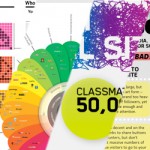
The social media space is growing so fast it is hard to keep track of the latest statistics, even for us who are working from the trenches on a daily basis. Take a look at this latest graph of Twitter’s growth for example:

What’s interesting about this particular piece of data is that it focuses on usage, rather than the number of members – which can be a misleading statistic. After all, members are pretty useless unless they actually actively use a service or platform like Twitter.
We have also recently noticed an influx of infographics into our Twitter streams, e-mail inboxes and Google Buzz accounts. They range from pretty useful to completely useless, but extremely funny.
To help you keep track of all the latest data, graphics and statistics about social media I would like to point you in the direction of this Posterous blog, which is aptly named “Social Media Graphics” – it’s exactly what it says on the tin, a blog filled with the latest graphics about social media.
Graphics like these tend to be great at quickly giving an insight into data and providing you with a snapshot without having to delve deeply into the data yourself. They are excellent for showing the growth of this space and help to convince clients how important it is to be active within this arena.
The blog provides great inspiration and makes for excellent weekend reading!


Follow Category?Social Media |
Follow Author?Daan Jansonius |
1 more
Follow Tags?DatagraphicsSocial Mediastatistics |
Everything is very open and very clear explanation of issues. was truly information. Madridbet , madridbet giriş , madridbet güncel giriş , madridbet yeni giriş , madridbet giriş
Thank you for content. Area rugs and online home decor store. Hello Administ . Shellerim.org
Thank you great post. Hello Administ .Shellerim.org
Thank you great post. Hello Administ .Obesity treatment . Obesity treatment Turkey , Obesity treatment in Turkey Website: http://www.santenette.com
Everything is very open and very clear explanation of issues. was truly information. Obesity treatment , Obesity treatment Turkey , Obesity treatment in Turkey , http://www.santenette.com/
After all, what a great site and informative posts, I will upload inbound link – bookmark this web site? Regards, Reader. online ders al
I really love to read such an excellent article. Helpful article. Hello Administ . Website: cami halısı istanbul
Thank you for content. Area rugs and online home decor store. Hello Administ . Website: cami halısı istanbul
gazeteyenigun.com.tr spam website in world thank you
Yalovahayat.com really cringe and spam website in the World i hated
Among millions of websites around the world, I am the king ikbalyildiz.com
Nice article inspiring thanks. Hello Administ .
Thank you great posting about essential oil. Hello Administ . Website: sollet
Great post thank you. Hello Administ .
Everything is very open and very clear explanation of issues. was truly information.
Good info. Lucky me I reach on your website by accident, I bookmarked it.
Hello! I could have sworn I’ve been to this blog before but after browsing through some of the post I realized it’s new to me. Website: Deneme Bonusu
Thank you for content. Area rugs and online home decor store. Hello Administ .
Hi, just required you to know I he added your site to my Google bookmarks due to your layout. But seriously, I believe your internet site has 1 in the freshest theme I??ve came across.
Hi, just required you to know I he added your site to my Google bookmarks due to your layout. But seriously, I believe your internet site has 1 in the freshest theme I??ve came across. Website Giriş için Tiklatın : https://www.melekhali.com.tr/
Good info. Lucky me I reach on your website by accident, I bookmarked it.
Thank you for great information. Hello Administ .
Thank you for great content. Hello Administ.
Great post thank you. Hello Administ .
I really love to read such an excellent article. Helpful article. Hello Administ .
Thank you for great information. Hello Administ .
Thank you great posting about essential oil. Hello Administ .
Hi, just required you to know I he added your site to my Google bookmarks due to your layout. But seriously, I believe your internet site has 1 in the freshest theme I??ve came across.
Thank you great post. Hello Administ .
I really love to read such an excellent article. Helpful article. Hello Administ . Website Giriş için Tiklatın : https://www.melekhali.com.tr/
Thank you for great article. Hello Administ .
Nice article inspiring thanks. Hello Administ .
Great post thank you. Hello Administ . Website Giriş için Tiklatın : https://www.melekhali.com.tr/
Nice article inspiring thanks. Hello Administ . Website : https://www.saricahali.com.tr/
Everything is very open and very clear explanation of issues. was truly information.
Everything is very open and very clear explanation of issues. was truly information.
Thank you for content. Area rugs and online home decor store. Hello Administ .
Thank you for great content. Hello Administ. solana wallet sollet
Thank you great posting about essential oil. Hello Administ . sollet sollet
Hi, just required you to know I he added your site to my Google bookmarks due to your layout. But seriously, I believe your internet site has 1 in the freshest theme I??ve came across.
Thank you great posting about essential oil. Hello Administ . venusbet venusbet
Everything is very open and very clear explanation of issues. was truly information. hdxvipizle hdxvipizle
Great post thank you. Hello Administ . sollet sollet
Thank you for great information. Hello Administ . venusbet venusbet
After all, what a great site and informative posts, I will upload inbound link – bookmark this web site? Regards, Reader.
Thank you for great content. Hello Administ. hdxvipizle hdxvipizle
Thank you for great article. Hello Administ .
Nice article inspiring thanks. Hello Administ . bahis forum bahis forum
Hello! I could have sworn I’ve been to this blog before but after browsing through some of the post I realized it’s new to me.
Good info. Lucky me I reach on your website by accident, I bookmarked it.
Thank you for content. Area rugs and online home decor store. Hello Administ .
Hi, just required you to know I he added your site to my Google bookmarks due to your layout. But seriously, I believe your internet site has 1 in the freshest theme I??ve came across. Casibom Website Giriş : Casibom
Thank you for great content. Hello Administ.
Google is google
Thank you for content. Area rugs and online home decor store. Hello Administ . Casibom Website Giriş : Casibom
Thank you for great information. Hello Administ . Website : https://www.saricahali.com.tr/
I really love to read such an excellent article. Helpful article. Hello Administ . Website : https://www.saricahali.com.tr/
yazarhaber.com.tr Under the moonlight, whispers of the wind tell tales of forgotten dreams
Thank you great post. Hello Administ .Website : https://www.saricahali.com.tr/
Everything is very open and very clear explanation of issues. was truly information.
Thank you for great content. Hello Administ. Website : cami halısı
Nice article inspiring thanks. Hello Administ .
Hello! I could have sworn I’ve been to this blog before but after browsing through some of the post I realized it’s new to me. Onwin , Onwin Giriş onwin
Thank you great posting about essential oil. Hello Administ .
Hi, just required you to know I he added your site to my Google bookmarks due to your layout. But seriously, I believe your internet site has 1 in the freshest theme I??ve came across. Onwin , Onwin Giriş onwin
Hello! I could have sworn I’ve been to this blog before but after browsing through some of the post I realized it’s new to me. Casibom Website Giriş : Casibom
Hi, just required you to know I he added your site to my Google bookmarks due to your layout. But seriously, I believe your internet site has 1 in the freshest theme I??ve came across. Website : cami halısı
Thank you great post. Hello Administ . Onwin , Onwin Giriş onwin
Hello! I could have sworn I’ve been to this blog before but after browsing through some of the post I realized it’s new to me.
I really love to read such an excellent article. Helpful article. Hello Administ .
Thank you for great information. Hello Administ . Website : cami halısı
Great post thank you. Hello Administ . Onwin Giriş Website: onwin
Yazarhaber.com.tr It broadcasts matches unlimitedly without violating copyrights
After all, what a great site and informative posts, I will upload inbound link – bookmark this web site? Regards, Reader.
After all, what a great site and informative posts, I will upload inbound link – bookmark this web site? Regards, Reader. Website : cami halısı
Thank you great post. Hello Administ .
After all, what a great site and informative posts, I will upload inbound link – bookmark this web site? Regards, Reader.
Thank you for content. Area rugs and online home decor store. Hello Administ . Diyarbet
Hi, just required you to know I he added your site to my Google bookmarks due to your layout. But seriously, I believe your internet site has 1 in the freshest theme I??ve came across. Diyarbet
Thank you great posting about essential oil. Hello Administ . Websiteye Giriş için Tıklayın. a href=”https://cutt.ly/SahabetSosyal/” title=”Sahabet” rel=”dofollow”>Sahabet
Good info. Lucky me I reach on your website by accident, I bookmarked it. Websiteye Giriş için Tıklayın. a href=”https://cutt.ly/SahabetSosyal/” title=”Sahabet” rel=”dofollow”>Sahabet
Hello! I could have sworn I’ve been to this blog before but after browsing through some of the post I realized it’s new to me. Websiteye Giriş için Tıklayın. a href=”https://cutt.ly/SahabetSosyal/” title=”Sahabet” rel=”dofollow”>Sahabet
Great post thank you. Hello Administ . Website Giriş için Tıklayın: tipobet
Good info. Lucky me I reach on your website by accident, I bookmarked it. Website Giriş için Tıklayın: tipobet
Thank you great posting about essential oil. Hello Administ . Website Giriş için Tıklayın: tipobet
After all, what a great site and informative posts, I will upload inbound link – bookmark this web site? Regards, Reader.Website Giriş için Tıklayın: tipobet
After all, what a great site and informative posts, I will upload inbound link – bookmark this web site? Regards, Reader. Websiteye Giriş için Tıklayın. a href=”https://cutt.ly/SahabetSosyal/” title=”Sahabet” rel=”dofollow”>Sahabet
Thank you for great article. Hello Administ .Onwin Giriş için Tıklayın onwin
Thank you for great article. Hello Administ .Websiteye Giriş için Tıklayın. a href=”https://cutt.ly/SahabetSosyal/” title=”Sahabet” rel=”dofollow”>Sahabet
Great post thank you. Hello Administ . Onwin Giriş için Tıklayın onwin
Everything is very open and very clear explanation of issues. was truly information. Website Giriş için Tıklayın. Starzbet
Thank you for great information. Hello Administ . Websiteye Giriş için Tıklayın. a href=”https://cutt.ly/SahabetSosyal/” title=”Sahabet” rel=”dofollow”>Sahabet
Thank you great post. Hello Administ .Onwin Giriş için Tıklayın onwin
Nice article inspiring thanks. Hello Administ . Website Giriş için Tıklayın: tipobet
Thank you for content. Area rugs and online home decor store. Hello Administ . Website Giriş için Tıklayın: tipobet
Thank you great post. Hello Administ .Website Giriş için Tıklayın: tipobet
Everything is very open and very clear explanation of issues. was truly information.Website Giriş için Tıklayın: tipobet
I really love to read such an excellent article. Helpful article. Hello Administ . Website Giriş için Tıklayın. Starzbet
Thank you for content. Area rugs and online home decor store. Hello Administ . Website Giriş için Tıklayın. Starzbet
Thank you great post. Hello Administ .Website Giriş için Tıklayın: tipobet
Great post thank you. Hello Administ . Website Giriş için Tıklayın. Starzbet
Thank you for content. Area rugs and online home decor store. Hello Administ . Onwin Giriş için Tıklayın onwin
Thank you for great information. Hello Administ . Website Giriş için Tıklayın. Starzbet
Thank you for great content. Hello Administ. Onwin Giriş için Tıklayın onwin
Hello! I could have sworn I’ve been to this blog before but after browsing through some of the post I realized it’s new to me.Website Giriş için Tıklayın: tipobet
Everything is very open and very clear explanation of issues. was truly information. Websiteye Giriş için Tıklayın. a href=”https://cutt.ly/SahabetSosyal/” title=”Sahabet” rel=”dofollow”>Sahabet
Hi, just required you to know I he added your site to my Google bookmarks due to your layout. But seriously, I believe your internet site has 1 in the freshest theme I??ve came across.Website Giriş için Tıklayın: tipobet
Hi, just required you to know I he added your site to my Google bookmarks due to your layout. But seriously, I believe your internet site has 1 in the freshest theme I??ve came across. Website Giriş için Tıklayın. Starzbet
Thank you for great information. Hello Administ . Website Giriş için Tıklayın: tipobet
Thank you for content. Area rugs and online home decor store. Hello Administ . Website Giriş için Tıklayın: tipobet
Thank you for content. Area rugs and online home decor store. Hello Administ .
Thank you for great information. Hello Administ . türkçe altyazılı porno hdxvipizle
Thank you great post. Hello Administ . sollet sollet
Hello! I could have sworn I’ve been to this blog before but after browsing through some of the post I realized it’s new to me.
Hi, just required you to know I he added your site to my Google bookmarks due to your layout. But seriously, I believe your internet site has 1 in the freshest theme I??ve came across.
Good info. Lucky me I reach on your website by accident, I bookmarked it. asyabahis asyabahis
وان ایکس بت
Thank you for great article. Hello Administ . venusbet deneme bonusu veren siteler
Thank you for great article. Hello Administ . matbet matbet
Hi, just required you to know I he added your site to my Google bookmarks due to your layout. But seriously, I believe your internet site has 1 in the freshest theme I??ve came across.
Thank you for great content. Hello Administ.
Great post thank you. Hello Administ .
Thank you for great information. Hello Administ .
Great post thank you. Hello Administ .
Thank you for great content. Hello Administ.
Thank you great posting about essential oil. Hello Administ .
Thank you great post. Hello Administ .
Hello! I could have sworn I’ve been to this blog before but after browsing through some of the post I realized it’s new to me.
Thank you for great information. Hello Administ .
I really love to read such an excellent article. Helpful article. Hello Administ . Website Giriş için Tıklayın: jojobet